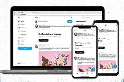
Earlier this month, anyone using Twitter would have noticed a sudden change in the way it looked.
A new font – Chirp – was rolled out with immediate effect. All tweets were henceforth displayed in this new font, which promised to be kinder to the brain and easier to read.
Since then, arguments have raged over whether that promise has been honoured. Many people dislike it, and Twitter has even vowed to tweak the redesign after users complained of headaches.
But in the world of typefaces, we might not always know what’s best for us. We may like the look of certain fonts, but this isn’t only about aesthetics. Even fonts we dislike could help us take in more information.
“The purpose of typography is to aid comprehension,” says Thomas Jockin, a typeface designer in New York. “That comprehension is incredibly complicated. There are multiple layers built on top of the basic decoding and we still don't have a full understanding of all how it all plays together.”
Chirp boasted sharper text and higher contrast which, at least in theory, should have made it more accessible and enabled faster reading. But complaints came thick and fast.
Any design changes implemented by online services are met with a certain level of annoyance, as font designer Fredrick Brennan noted in an interview with Slate last week.
“When people say that they find the new letters more difficult to read than before, my first assumption would be that that’s only because they’re so used to seeing Twitter’s previous default font,” he said. “The human brain is flexible enough that it can learn how to read any kind of script. When you try to present it with one that’s differently designed, it will find that challenging.”
But for some people, the issues seemed more serious.
“This font is hard to read, the letters and numbers all seem to blur together, it gives me immense eye strain, and I think the uneven character height is giving me motion sickness,” read one tweet.
Fonts can evidently distress and disorientate. But, according to Jockin, they also have the power to improve readability. He has developed a font designed to improve reading speeds, Lexend, which was added to Google’s suite in 2019. By removing serifs (the decorative curls or lines) and adjusting character spacing and scaling, he hoped to improve comprehension and retention of information. Studies showed it to be effective.
“Recently, I started using Lexend to study my Spanish vocabulary list and raised my Spanish grade from a D to a B in just a few weeks,” reported one student.
“Weight of font matters,” says Jockin. “It can’t be too bold, but more often the problem is that they’re too light. If your font is too tightly spaced, that can cause disfluency. And x-height – the positional relationship between lower case and upper case letters – that’s generally the property you need to look at the most. But the whole point is that it’s not one size fits all.”
To that end, Lexend was designed in a range of widths, so everyone can have a Lexend font to suit them.
Other designers have been working to improve readability, too. Dyslexie, by designer Christian Boer, was unveiled in 2018 to target the swapping or mirroring errors experienced by dyslexic people. JetBrains Mono, a font for software developers, appeared in 2020, with elongated characters and greater distinction between the number 1, capital I and lower case l.
Last year also marked the launch of Atkinson Hyperlegible, named after the founder of the Braille Institute. It introduced a greater distinction between similar-looking letters to improve legibility. In doing so, it broke some rules; the thinking by designers was that if a font looks too harmonious, it could make it more difficult to read.
Chirp also broke some of those rules (“it strikes the balance between messy and sharp,” said Twitter) and the reaction showed how strongly we feel about the appearance of the words we read.

However, one 2019 study found that if we were more open-minded, we could be reading faster. Titled The Right Changes to Text Format make Large Impacts on Reading Speed, its author, Shaun Wallace of Brown University, found that while 73 per cent of participants believed their preferred font would be the most effective for them to read in, this was not the case. The average reader could speed up their reading by 38 words per minute simply by adjusting the font to one that suits them better.
“This points to a future in which machines help adult readers to reach for their full reading potential,” concludes the study.
Is that happening? Fonts are certainly changing. The old warhorses of Helvetica and Futura have recently had updates. Microsoft is bringing in a new default to its Office suite next year to replace Calibri, which has been in place since 2007. In recent years, firms have switched to in-house fonts for their products, including Apple (San Francisco), Intel (Clear), Google Play Books (Literata) and Amazon Kindle (Bookerly). But the reasons for such changes aren’t always altruistic.
“Sometimes it's brand and positioning," says Jockin. “They want to create a very clear experience, and typography is part of the equation. Sometimes it’s licensing. Sometimes a firm needs to globalise and switch to a font that has the necessary language support.”
Given that our favourite font and our easiest-reading font are personal to each of us, Chirp was always going to have a rough ride when it was forced on Twitter users.
“One-font-fits-all is the prevailing model for typography,” says Jockin, while noting there’s no effective way – yet – of measuring which font might be best for each reader. His current venture, Readable Technologies, is working on it, building a system which takes accurate measurements of reading behaviour from a webcam.
Until that emerges, we’ll just have to tolerate Chirp and any other fonts that are foisted upon us. And who knows, we might even get used to them.